In this article, we dive into the fascinating world of color, exploring how different hues shape corporate identity and influence consumer psychology. Understanding the impact of color can enhance your branding strategy and help you build stronger connections with your audience.
1. The Psychology of Color
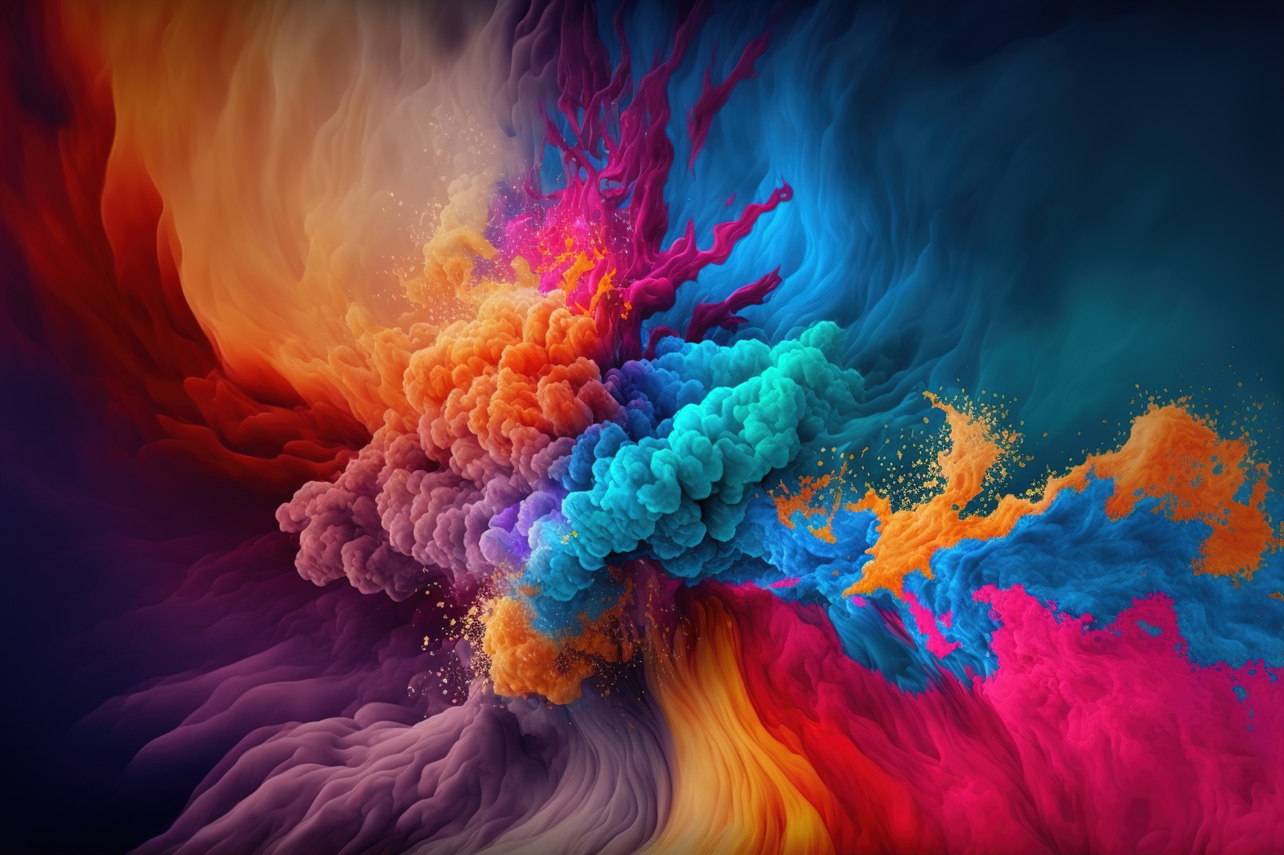
Colors evoke emotions and can influence perceptions, behaviors, and decisions. Beyond the basic colors, there are thousands of shades and color combinations that can generate different emotional responses. Below is an indicative overview of the psychological impact of various colors:
Red: Evokes excitement, passion, and urgency. It is often used by food and beverage brands to stimulate appetite and create a sense of urgency.
Blue: Conveys trust, calmness, and reliability. Commonly used by technology companies, financial institutions, and healthcare providers.
Green: Symbolizes nature, growth, and health. Typically used by environmentally friendly brands and wellness-related products and services.
Yellow: Represents happiness, energy, and optimism. Used by brands aiming to evoke cheerful and positive emotions.
Purple: Associated with luxury, creativity, and sophistication. Often used by premium brands, especially in the beauty and wellness sectors.
Orange: Communicates enthusiasm, creativity, and friendliness. Popular with brands targeting younger audiences.
Black: Signifies elegance, power, and modernity. Favored by high-tech and fashion brands.
White: Reflects purity, simplicity, and cleanliness. Common in minimalist designs and health-related branding.
Pink: Associated with care, tenderness, and femininity. Used by brands primarily targeting female audiences, especially in beauty and fashion.
Brown: Suggests stability, reliability, and natural authenticity. Frequently seen in brands promoting organic or rustic products.
Professional tip: Conduct a color psychology test with sample groups to observe emotional responses before finalizing your brand’s color palette.
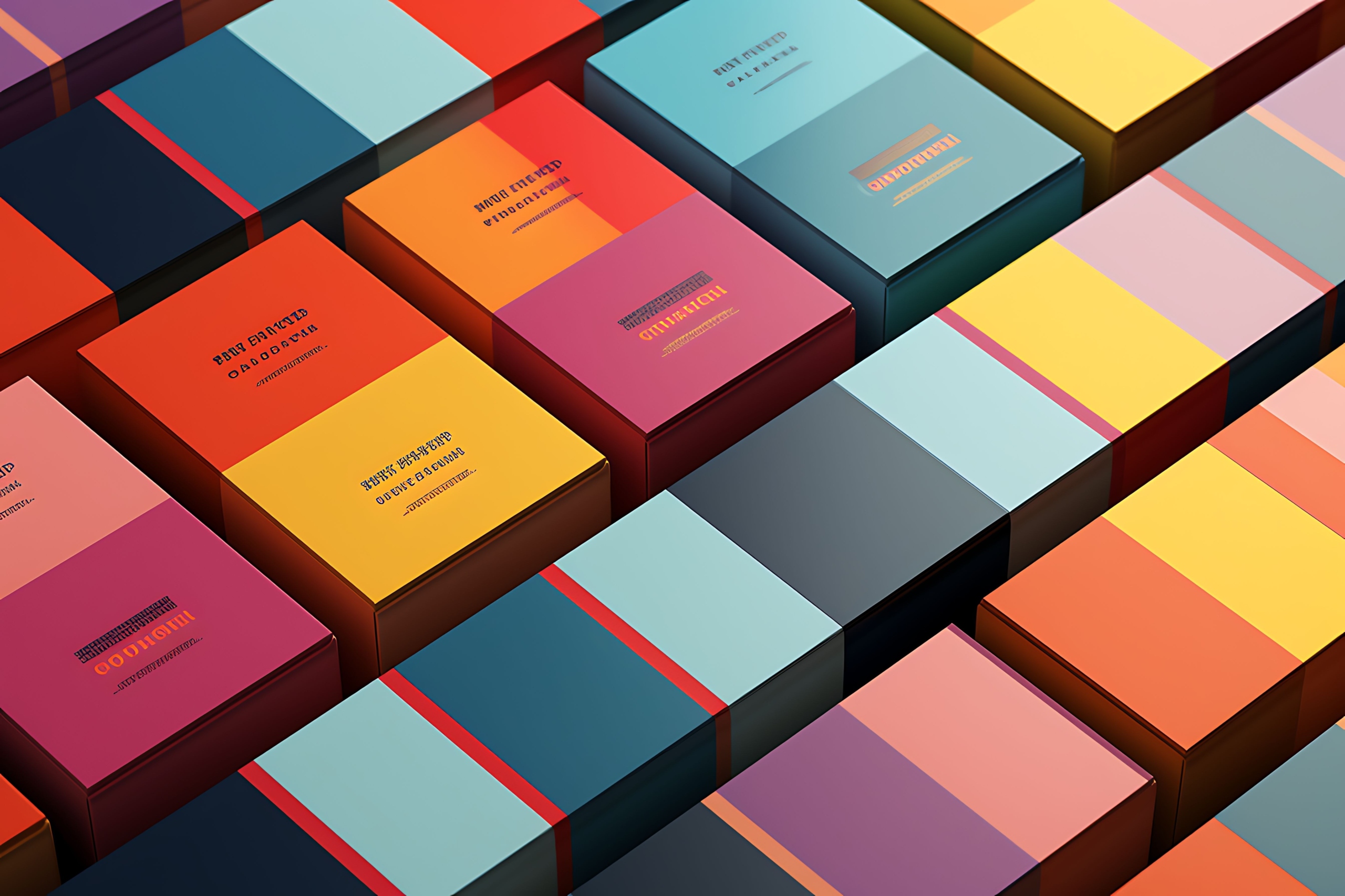 2. Color in Corporate Identity
Choosing the right colors is crucial to building a strong corporate identity. Here’s how to effectively integrate color into your brand:
Primary and secondary colors: Select a primary color that represents your brand’s core message. Use secondary colors to complement it and create a harmonious palette.
Consistency: Maintain color consistency across all corporate identity materials to enhance brand recognition.
Logo design: Ensure your logo uses visually appealing colors that clearly reflect your brand identity.
Brand storytelling: Use color to support your brand story by reinforcing the emotions and values you want to communicate.
Professional tip: In your corporate identity guidelines, clearly and precisely define the technical color specifications (RGB, CMYK, RAL, and Pantone codes) to ensure consistent appearance across different media (e.g., paper, signage, screens, clothing, vehicles, buildings, etc.).
3. Cultural Differences in Color Perception
 Colors can carry different meanings across cultures. Here is a brief overview:
Red: In Western cultures, red signifies love and passion. In China, it represents luck and prosperity.
White: In Western cultures, white symbolizes purity and is associated with weddings. In some Eastern cultures, it is linked to mourning and funerals.
Black: In Western cultures, black is often associated with elegance and formality. In many cultures, it also represents mourning and death.
Yellow: In Japan, yellow symbolizes courage. In Western cultures, it often represents happiness and caution.
Professional tip: Understand the cultural context of your target market to ensure your color choices are well received and culturally appropriate.
4. Examples of Successful Brands
Below are some brands that use color effectively to define their identity:
Coca-Cola (Red): The vibrant red conveys excitement and passion, helping to stimulate impulse buying.
Apple (White and Space Gray): Apple uses clean, minimalist colors such as white and gray to represent simplicity, innovation, and elegance.
Starbucks (Green): Green is associated with growth, nature, and environmental awareness, aligning with Starbucks’ brand identity.
Cadbury (Purple): The rich purple used by Cadbury conveys luxury and indulgence, perfectly complementing its premium chocolates.
Professional tip: Analyze successful brands both within and outside your industry to see how they use color to strengthen their brand identity.
 Color is a powerful tool in branding and psychology. By understanding the emotions and cultural perceptions associated with different colors, you can make informed decisions that strengthen your brand identity and resonate with your target audience.
In our next article, we will explore “Innovative Uses of Typography in Branding.” Discover how to make typography work for your brand and create a lasting impact.